Showing posts with label case accumulation. Show all posts

Saturday, 22 August 2015

Watch that last step, it's a doozy..

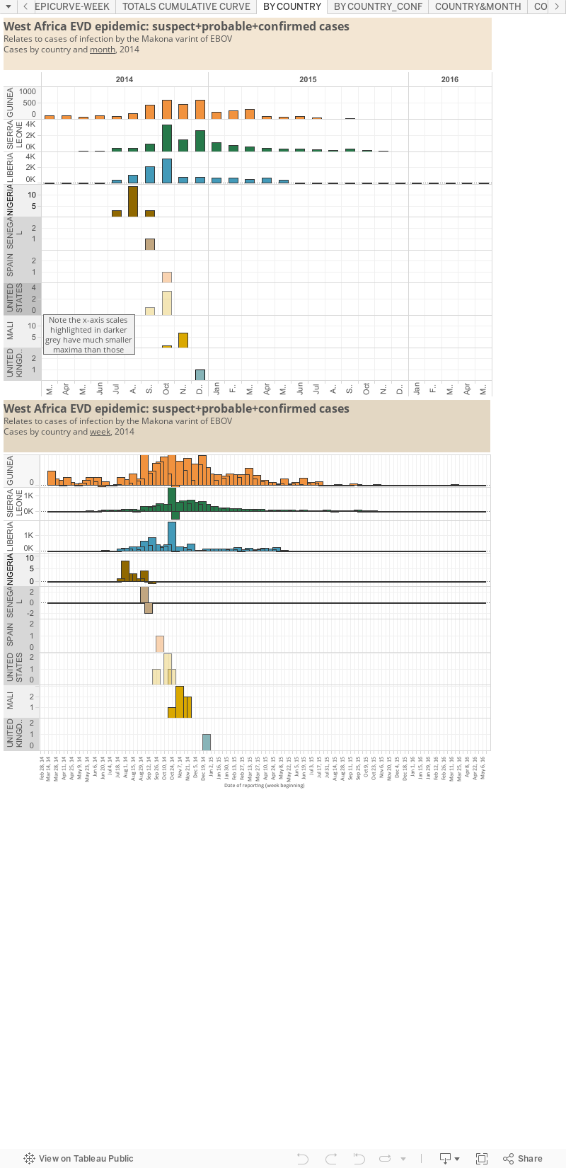
For each of the past five weeks, Guinea has continued to throw up 1-5 Ebola virus disease (EVD) cases. But transmission chains are known and so this will hopefully stop very soon. Tracking down contacts that have been lost to follow-up and unknown spread in the community remain big variables in this equation. 

Sierra Leone has reported 1-3 EVD cases over that period - but importantly, the last of those cases was reported by the World Health Organization (WHO) on the 10th of August - 12 days ago. We've seen one full case-free reporting week so far, and the next is looking good for Sierra Leone as well. 

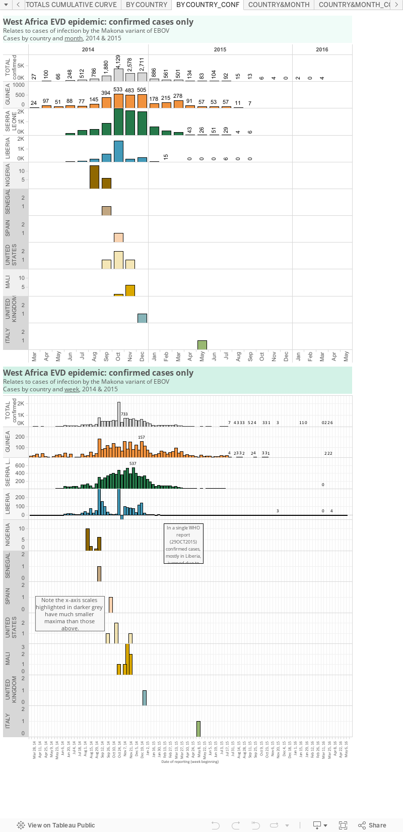
The latest confirmed EVD case data plotted below - which stretches from February to last Friday - we can really see how the death of an epidemic has occurred in steps. For Liberia, there was a very dramatic and precipitous decline, but for Sierra Leone and Guinea, it has been a slower process. 

It looks like we will see an end to the EVD epidemic as we saw it begin, with Guinea harbouring cases. 

And then we wait, watch and remain wary as the 21-day individual incubation periods elapse, then the 42-day national incubation periods lapse, indicating no known ongoing transmission, and finally the many months of vigilance pass. I'm not sure we're really that confident about the upper limit of this final step yet. 

I can't imagine the period of vigilance will pass entirely without incident - Liberia has already taught us a hard lesson about occult transmission - but we've all been wrong about Ebola virus before and it would be great to be wrong about this. Here's hoping those final steps are a smooth descent to zero.


Confirmed cases added by each WHO Situation Summary of Situation Report.
Modified from my Ebola virus disease graphs and tallies page.
Click on image to enlarge

Saturday, 13 June 2015

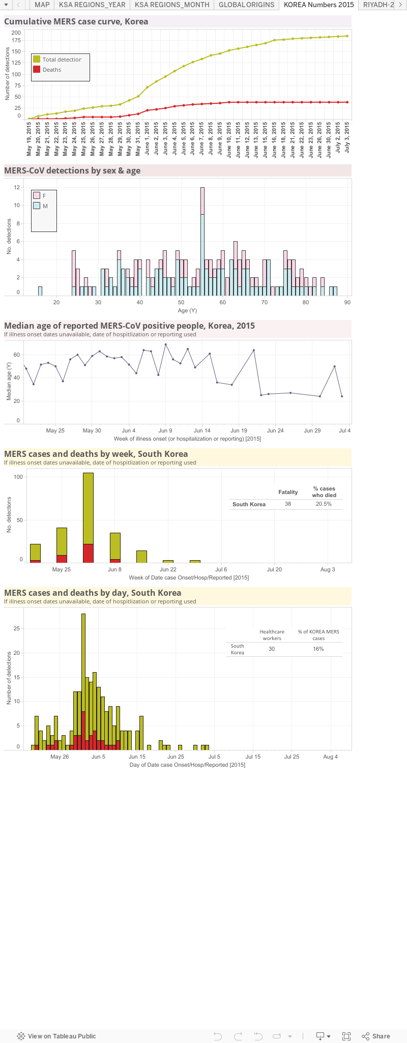
Middle East respiratory syndrome (MERS) coronavirus: Outbreak maps and graphs, South Korea

This static data visualization was created using data from FluTrackers, the World Health Organization and the Korean Broadcasting System (KBS).

Wherever possible, the dates are those for a case's onset of illness, but if that is unavailable then the date for hospitalization or if that is unclear, the date that case was reported.

Because the WHO obviously have more detailed information, I recommend you keep an eye on their site, so long as it is being maintained, for more accurate epidemic curves.


References...

2. The Korean Broadcasting System's News websites
http://dj.kbs.co.kr/resources/2015-06-08/ &
http://dj.kbs.co.kr/resources/2015-06-04/
3.  World Health Organization pages
Main landing page on MERS and MERS-CoV (includes link to WHO line list under General Information)
http://www.who.int/emergencies/mers-cov/en/
Disease Outbreak News pages
http://www.who.int/csr/don/don_updates/en/
 
News on the current situation
http://www.wpro.who.int/outbreaks_emergencies/wpro_coronavirus/en/
Summary of Korean statistics-rapidly updated

http://www.wpro.who.int/outbreaks_emergencies/summary.of.MERS.stats/en/

Saturday, 23 May 2015

Guinea EVD cases rise - but not like they have before...

Edited for clarity 24MAY2015 AEST
The uptick in cases this week from, in particular, Guinea interrupted what was looking promisingly like a continuous downward trend in cases all the way to zero - yes, that was too much to hope for.

However, it's worth keeping some context around this:
  1. Everyone actually working in this space has forewarned us that getting to zero Ebola virus disease (EVD) cases was never going to be an easy journey.
  2. The indicators have consistently shown more reluctance in Guinea to "kick out Ebola" than in Liberia or Sierra Leone. What caused that reluctance, I don't fully understand from my totally uninvolved chair a million  miles away.
    I know right? Surprising.
    Yes-I'd like a specific reason, all wrapped up and presented to me. I'm simplistic and selfish that way. Get that for me will you?? 'Cause I'm totes sure you haven't been trying your collective butts off all this time.
  3. There were fewer new confirmed EVD cases this past week than in the tally for the week before or for other weeks - look back at January 2015, or October 2014 or June 2014, or any of a number of other dates when cases were accruing at a much faster rate than now (graph below).
    That is a silver lining. It's far from ideal, but it's not a return to the worst of it.
All along there has been something different about Guinea and that is now a clear sticking point in the final push to rid its people of Ebola virus|Makona. It never reported, as Sierra Leone did, days with averages of more than 100 cases. 

If we knew what was different about the people, communication, geography, weather, traditions, habits, thinking, ETUs, labs, government...or whatever..then we could perhaps better target the problem(s) and get to zero sooner. 

That will be core business for the next step to occur.

Click on graph to enlarge.

Wednesday, 6 May 2015

Snapdate: Confirmed Ebola virus disease cases - the end in sight?

I think we're a little bit beyond "jinxing" something by pointing it out, so here is graph of the confirmed Ebola virus disease cases based on the World Health Organization report date (Situation summary or Situation Report), including a basic model to predict when cases may hit zero, if nothing changes.

The P-value for this linear trend model is 0.00067. The standard error = 19.29;R-square = 0.14.
Click on graph to enlarge

I use Tableau Desktop Public Edition v9.0.0 for my graphs these days - and have taken advantage of its inbuilt linear trend model for this chart. This "model" accounts for precisely nothing apart from the trend based on the numbers that are available and have been plotted in this particular way, on this day, near a full moon. 

Reported numbers or outbreaks could flare up tomorrow or dry up overnight. 

I can say that over the past 2 weeks, data from each new summary or report have moved the predicted "end" data closer - from mid-June to now early June.

I am not an expert at modelling or statistics so please just take this at face value. The line suggests that if all things stay the same, we will reach zero considered cases per report around the 3rd of June 2015.

Please let it be so. 

Realistically, we may be heading for another "step down" - followed by a smaller trickle of ongoing cases for some period, ahead of a final push to zero. But there are experts who will know more about this than I.

Once we get to zero, the 42 day count begins.

Sunday, 18 January 2015

Some changes to my Ebola virus disease (EVD) graphs...

To perhaps provide clearer info and to accommodate the changes in the epidemic, namely the reduction in cases and the focus on ridding Guinea, Liberia and Sierra Leone from any and all cases of EVD, I've made some tweaks to my Tableau data visualizations (or dashboards). Briefly...

The dots take their leave.
Was this.

Gone are the dots in my cumulative chart, to be replaced by a third "area under the curve" style graph. 

This brings out the importance of the confirmed cases-more on why that matters later. This week Cedric Moro @Moro_Cedric) asked why we seem to have a relatively large number of suspect and probable cases released in each report World Health Organization situation report (WHO SitRep) or summary (SitSumm). I imagine this is due to the turnaround time once the sample arrives, occasions when results may need to be repeated to confirm strange results, time between seeing a patient and sampling them for Ebola virus testing...but there are probably more obvious reasons. Chime in.


Is now this.

Plot the right data for now.

I'm not an epidemiologist - yes, I know you epidemiologists out there already know that. But I like to play with numbers and pretty colours. So this week I got some information that I didn't have before - the reason why use of cumulative curves was frowned upon by the excellent numbers communicator, Prof Hans Rosling (@HansRosling). 

I had read previously that Prof Rosling was no fan of cumulative curves in graphically explaining progress in ridding west Africa of EVD. But I like them - I've even explained, in my epidemiologically unprofessional opinion - how a flat plateau on a cumulative curve clearly shows the stalling of an outbreak or epidemic. Turns out I either didn't read all of that quote, or the text I read didn't contain the key fact. 

It's not really that cumulative curves are at fault, it's what they are plotting that can mislead. The important thing to plot, especially now that cases are fewer and laboratory capacity is in place, are the confirmed cases, not the total cases which include suspected+probable+confirmed cases.

Confirmed cases are Ebola virus, unconfirmed cases may never be.

In the last WHO SitRep (14-Jan-15) it was noted..
All 54 EVD-affected districts (those that have ever reported a probable or confirmed case) have access to laboratory support within 24 hours of sample collection.
"Access" doesn't mean a result will appear 24 hours after sampling though. But even with this shorter access period, suspected and probable cases are in fact still making up a decent proportion of the total cases reported in even the most recent reports. For example...
  • In Guinea the numbers between 14-Jan-2015 and 15-Jan-2015 saw suspected cases rise by 3, probables stayed the same and confirmed cases lifted by 8; 27% of the total cases reported between this pair of reports were not confirmed to be Ebola virus infections, at the time of reporting. 
  • In Liberia over this period, suspected cases rose by 29, probables by 2 and confirmed case numbers did not change-so none of the 31 cases were laboratory confirmed as an Ebola virus infection. 
  • In Sierra Leone over this period, suspected cases rose by 10, probables remained the same and confirmed cases lifted by 16; 38% of the total cases were not confirmed to be Ebola virus infections.
If we compare those figures to 2 SitReps from well before the WHO had declared the 24 hour laboratory support, dated 24-Sept-2014 and 26-Sept-2014, we find that Guinea only had 8% of its tally unable to be confirmed, Sierra Leone was at 12% not confirmed while 87% of EVD-like cases added to Liberia's tally between reports were not confirmed as due to and Ebola virus infection. 

This may not be a fair comparison of course and it's not one that accounts for every report - just the 2 pairs of reports I arbitrarily chose as being from 'now' and 'back then'. Nonetheless, I expected there to be a bigger and more obvious difference in the proportion of cases that were now being quickly confirmed-I thought that percentage would have gone up as the unconfirmed cases were less frequent. Instead, it seems that the proportion is not that much better. Perhaps this is an indication of the other diseases which mimic EVD early on, that normally emerge at this time of year or have emerged because of the state of healthcare in the countries blasted by the EVD epidemic. As I said above, it may also just be the time it takes to observe, collect a good history and make a clinical decision before a sample is collected. It may also be that laboratory turnaround times (including testing, verifying and reporting) take a bit longer than we naively expect from reading that quote from the WHO above.

More visualizations of confirmed case numbers.

So for the reasons above, I've added the changes I've mentioned and I've also duplicated some of the "total case" graphs by creating versions that only include confirmed cases. 

In the example below I'm showing that it looked like Liberia was experiencing an uptick in cases for 2 consecutive reporting weeks (blue bar graph, right column). I tweeted about this during the week. In fact, those rises were due to unconfirmed cases. The confirmed case plots (green titles in the right-hand column of graphs) show the consistent decline in new EVD cases we had been hearing about. 

Live and learn.

Graphs plotting total EVD cases (including suspected, probable and laboratory confirmed;
brown title bars, left-hand column) 
versus graphs plotting only the laboratory confirmed cases
(green title bars, right-hand column). 

Data are from WHO SitReps and SitSumms
Click on image to enlarge.

Thursday, 18 December 2014

Ebola double vision is clearing...

A quick follow up from my post in October entitled "Ebola double vision".

I've adjusted that graph and it adds another view of how the Ebola virus disease (EVD) epidemic is, in terms of overall case numbers, showing consistent signs of slowing. 

The time it takes for the case total to double (the doubling time) has stretched out from doubling every month or so, to taking about a month and a half to double.

But far from breathing a sigh of relief, the numbers in Guinea, which have never appeared consistently under control, and the still very high numbers in Sierra Leone, highlight that the epidemic is not yet leashed and the need remains for continued vigilance and more of the same hard and risky work being done by those in and around the region. In Liberia, the country that supplied the highest proportion of EVD cases leading up right up until this month, case numbers were down to just 75 in the previous week (reporting week #38). For context, that's still higher than the total of about 15 past outbreaks since 1976. And of course, this entire epidemic started from just 1 case. 100% of infected people need to be isolated and looked after (hydrated given pain relief and antibiotics among other things), 100% of burials need to be safe, and 100% of contacts need to be traced. That represents a huge task ahead of the stalwart healthcare, aid and many other support workers who have been facing Ebola virus every day for months and months.

The time between total case doublings.
For 4 doublings in a row it took a month or so, but the most
recent doubling took 44-days. 

Click on image to enlarge.

Sunday, 2 November 2014

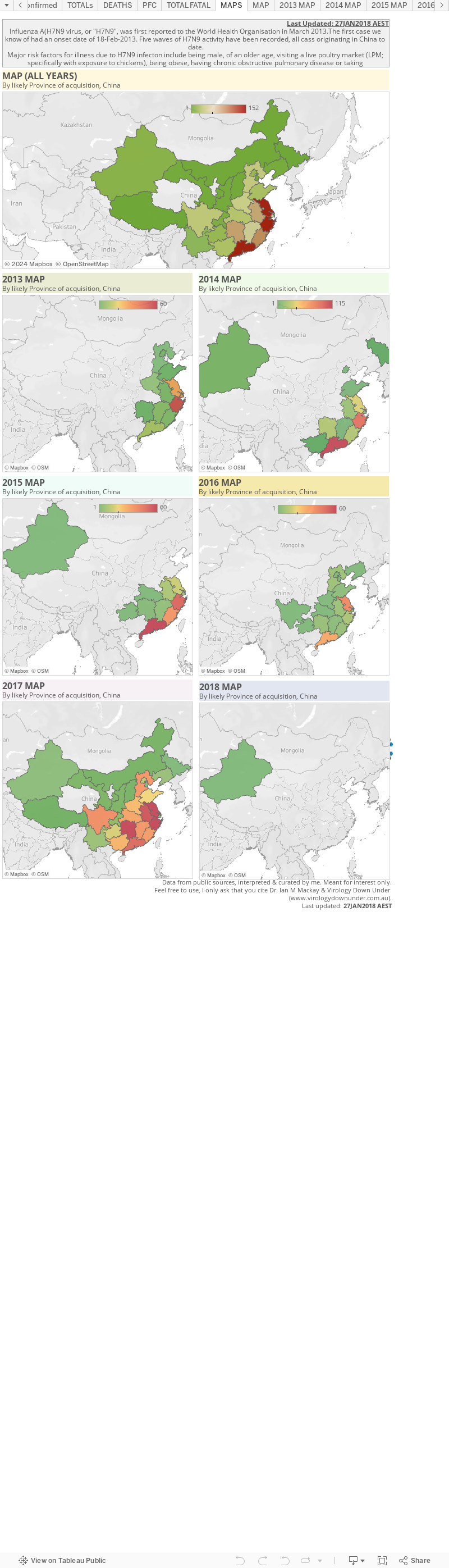
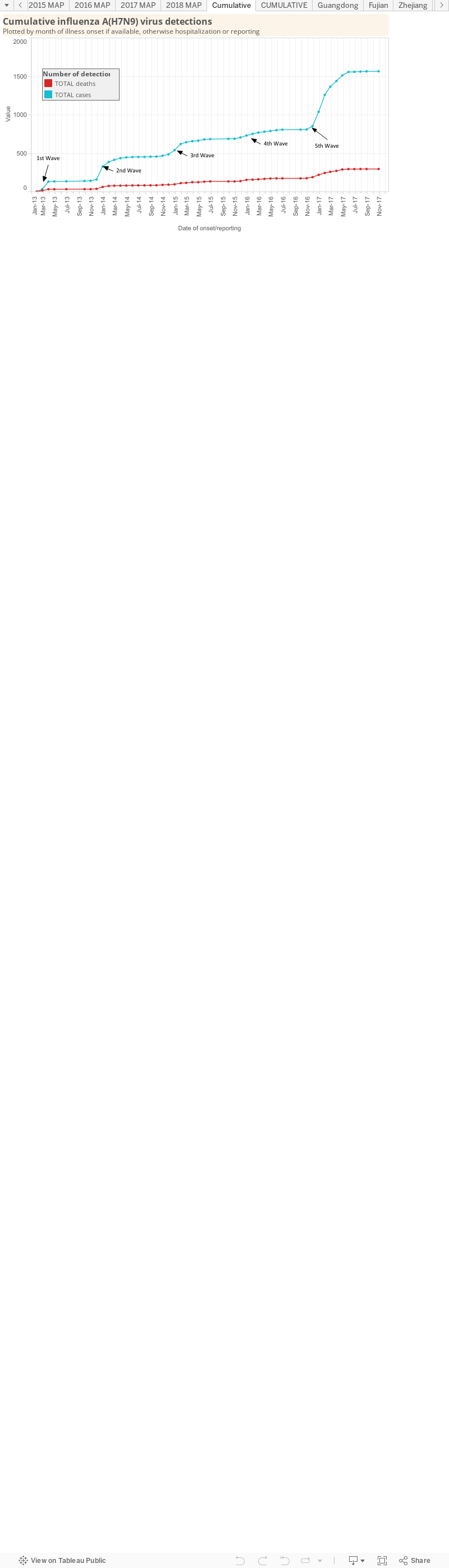
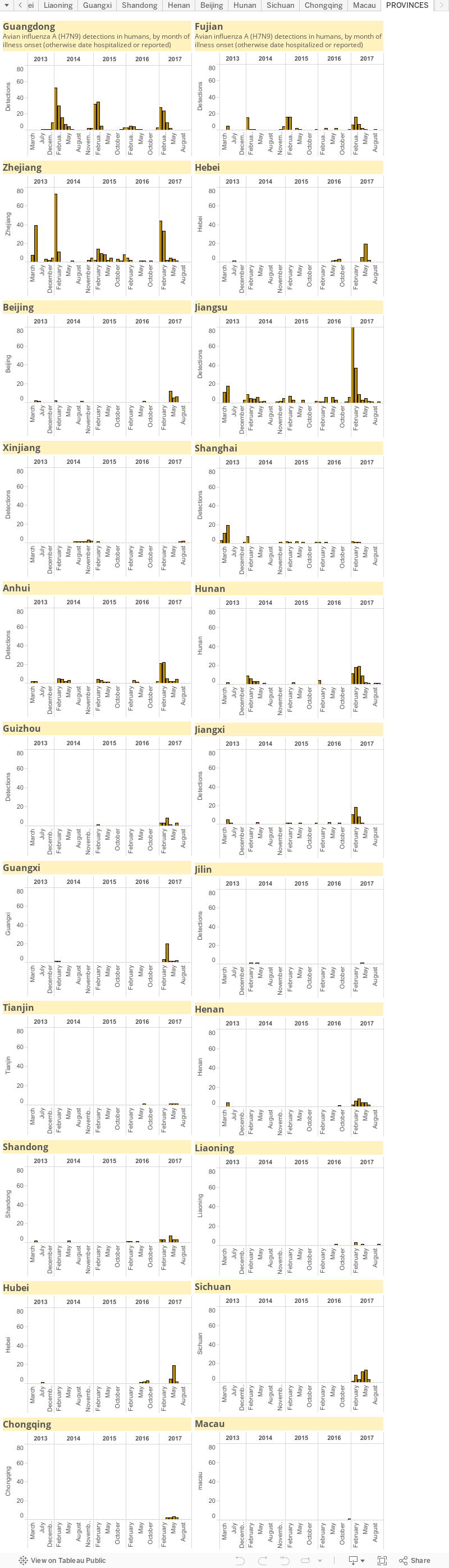
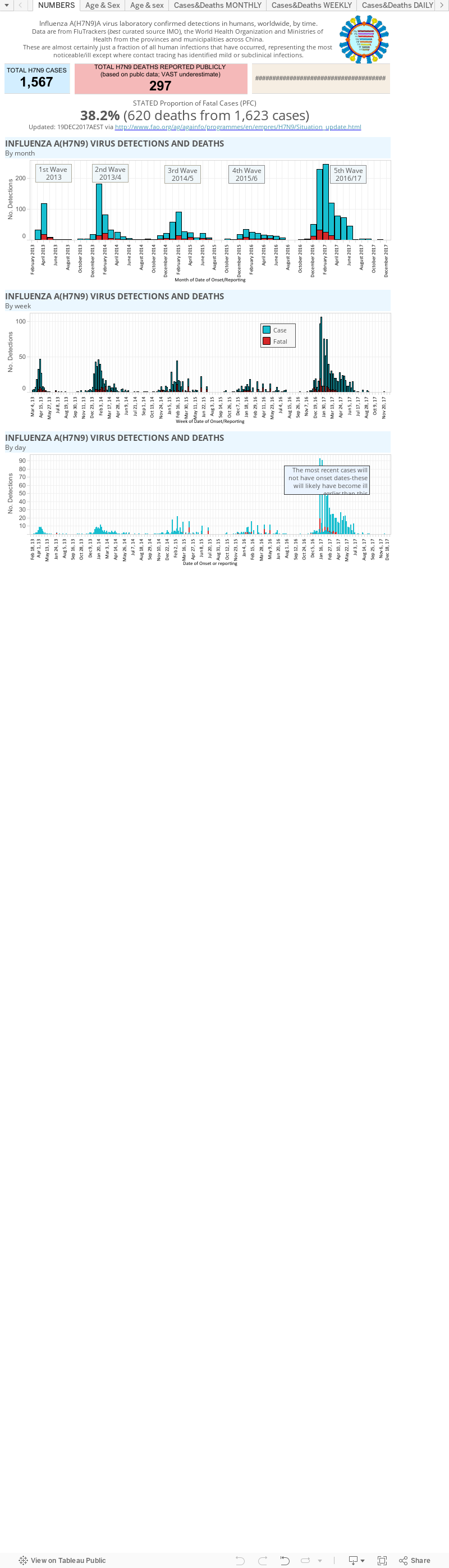
Influenza A(H7N9) virus: detection numbers and graphs...

This is a static page that houses my graphs of influenza A(H7N9) virus ("H7N9") numbers produced by the various Ministries of Health for the provinces and municipalities of China, Hong Kong's Centre for Health Protection (CHP) the World Health Organization and FluTrackers.

Please be aware that these numbers are in flux during the winter epidemic. They are a guide only.

There is also an accompanying map page which for now is located here.


Reminders: 
  • The graphs above, as with all on VDU, are made for general interest only. They are also freely available for anyone's use, just cite the page and me please. The data can be downloaded by clicking on the "Download" link at the bottom-right of each dashboard. It may be that I have misinterpreted the language in the reports (sometimes a little tricky to wade through) or miscalculated some totals based on the way data have been presented.
  • In any outbreak, epidemic or pandemic caused by a know or emerging pathogen, the numbers presented publicly, and used in these graphs, are expected to represent only a fraction of all the cases that have and are occurring. This is just the nature of the imperfect biological'ness of these events.
  • I am only able to plot what is publicly available-you could do this too. No secret associations or back-room deals provide me with these data.

Friday, 31 October 2014

The bad the worse and the over-interpreted...

EVD case numbers between WHO reports. 
The World Health Organization (WHO) Ebola virus disease (EVD)case numbers that came out on 29-Oct were pretty big (see graph on the left). As if there weren't already enough new cases and deaths every 2-5 days, now there is this bolus of 3,562 cases added to the total. And a net change in deaths of -2? What the heck?  

Let's see if we can add some context.

According to a number of past WHO reports, a lot of effort has been going in to trying to collect data more effectively including improving the linkage of lab results to cases, cases to deaths, lab data to deaths and probably a million other things. 

Dr Bruce Aylward
http://www.who.int/dg/adg/aylward/en/
In the previous Roadmap SitRep and Roadmap update, the Liberian numbers did not move - they even had the same date. That was new and it was concerning because it suggested that reporting had been stopped or collapsed entirely. However this new large download of cases is in some way good news because it suggests reporting is working and the systems and processes are coping - although undoubtedly still stressed - again. 

The thing to be aware of is that these are not cases that have all been detected or all occurred since the last report 5 days previously. According to Dr Bruce Aylward, WHO Assistant Director-General, Polio and Emergencies, during a preceding media conference (and my thanks Martin Enserink for asking the important question; underlining is mine)..

In terms of the jump in the number of cases, one of things that we've talked about in the past on this is that with the huge surge in cases in certain countries, particularly in September and October, people got behind on their data.
They ended up with huge piles of paper in terms of cases, etc, and we knew and I actually said to you the last time, we are going to see jumps in cases at certain times that are going to be associated more with new data coming in but it's actually on old cases.
And a couple of days there were about 2,000 additional cases in, if I remember correctly, it was actually the Liberia case report but most of these were old cases because remember they got swamped a couple of months ago with a lot of new cases and just got behind on their data, so a lot of that is about reconciling new data.
If we look at sort of a seven day rolling average number of cases which have been around 1,000, just under that, about 900, there hasn't been a big change in that in the recent weeks.
So the 3,562 cases come largely from the past as well as the present. It's not that the sky has fallen in the past 5 days. Which is good news. But of course, that puts us back to "just" 1,000 or so Ebola virus disease cases a week. In other words, in just 1 week there are more cases than in any individual outbreak since 1976. 


The cumulative EVD case curve at 29-Oct
However, this week has seen a few articles and comments noting that the number of new cases in parts of Liberia seem to have fallen slightly. 

This seems to be a real trend in that there are fewer burials and more empty treatment beds and fewer cases found when sought in the community. Why there are fewer is not precisely known and it is far to early to rely on this yet. But we do know that there are better numbers of safe burials, better education, more experience with the disease, more help and facilities and more PPE comapred to when this started. 

The three countries with intense transmission still require a lot of help from us though - that urgency must not let up. Remember that cases had dropped a lot back in May - and now look where we are.  

If you can't get there in person to offer specialist help, and most of us cannot, keep bringing the issue to the attention of your country's leaders, learn about the virus and the disease from trusted sources and help teach others and head off ignorant comments, and donate some (some more) money to those groups who can make a real difference on your behalf (I've listed some great options here). 

Fighting the fire at its source is still the best way to help save lives in Guinea, Sierra Leone and Liberia and to stop new outbreaks from occurring in other countries.

References..

  1. WHO Ebola Roadmap SitRep#10
    http://apps.who.int/iris/bitstream/10665/137376/1/roadmapsitrep_29Oct2014_eng.pdf?ua=1
  2. Virtual Press Conference transcript
    http://www.who.int/mediacentre/multimedia/vpc-29-october-2014.pdf?ua=1

Friday, 26 September 2014

MERS-CoV data request: A response from the Ministry of Health

Four days after I posted a blog requesting missing data on retrospective Middle East respiratory syndrome coronavirus (MERS-CoV) detections and deaths, I received a response. 

Dr Anees Sindi, Deputy Commander of the Command and Control Centrer, Ministry of Health, Saudi Arabia replied. With his permission, I have reproduced his reply below.
______________

Sent: Tuesday, 23 September 2014 6:36 PM
To: Ian M Mackay
Subject: Re: your request for missing data on retrospective MERS-CoV detections

Dear Dr. Mackay,

I’m writing in response to your blog posting entitled “A request for missing data on retrospective MERS-CoV detections.”

Thank you for acknowledging the steps that the Ministry of Health’s Command & Control Center has taken to ensure members of the public -- including researchers around the world -- have access to real-time information about MERS-CoV cases in the Kingdom of Saudi Arabia.

These daily postings are a small step on our journey toward full transparency. We want scientists to have access to the data they need to produce meaningful publications that advance our understanding of this disease for the benefit of mankind.

With that in mind, I am happy to inform you that the Ministry of Health is in the process of preparing additional data for public release. I will follow up with you once we have a confirmed release date.

Collaboration with the international research community is a key pillar of our work. In addition to sponsoring more than 30 research projects focused on MERS-CoV, the Ministry of Health has opened its doors to academics and experts from the World Health Organization and U.S. Centers for Disease Control & Prevention. MOH shares more data with the WHO than is required under the International Health Regulations, and we stand ready to support other scientists with an interest in better understanding coronavirus.

Thank you again for your interest in our work.


Best Regards,

Dr. Anees A. Sindi
Deputy Commander
Command and Control Center, Ministry of Health
Saudi Arabia


______________

This is fantastic news and I am very excited to hear that we may soon be able to complete the data picture for MERS-CoV. 

I am most grateful to Dr Sindi, the Minister and the Ministry for taking my request seriously and for replying to it so quickly.


With these data in hand, many of us will be able to build better epidemiological picture of the timing, spread and impact of MERS-CoV over the past 2 years as well as more specifically quantify MERS among fatal cases. 

These data do not answer all the questions we have of course, but they definitely answer some, and for that I'm thankful.

This social media thing does seem to have some impact.

Thursday, 18 September 2014

Updating a model of a modern Ebola epidemic...

Professor David Fisman, University of Toronto, Canada published one of the excellent recent models designed to estimate where Ebola virus disease case numbers might be heading.[1] He has updated his model using the latest World Health Organization EVD data that includes up to 13-Sept.

This morning I awoke to find the fruits of his labour generously presented to the world via Twitter.

I'm constantly impressed by how much info can and is being provided for everyone to share, discuss and  constructively mull over. This is just the latest fantastic effort.


Prof Fisman's (@DavidFisman) model has provided a very close estimate when compared to the real figures on which it is, of course, based (Figure 1.). His estimates have not changed with the latest data. He calculates an overall R0 of 1.75, and 'd' (a value that can indicate the level of control; when d is zero, you have uncontrolled exponential growth) is at 0.0078. The d values for different countries in the outbreak, differ.

Figure 1. Showing that the model (black line) fits extremely well
to actual reported case numbers (red bars) to date
The projected end date is November 2016 with a final size of approximately 480,000 cases. (Figure 2) This is just based on current numbers and without knowing what interventions are coming not how successful they will be. Prof Fisman says his model currently predicts an epidemic peak in June-2015 at which time there could be 227,000 cases. By Jan-2015, projected case counts reach 28,450.

Figure 2. Extending the model into 2017.
Red curve (right y-axis): incidence by 15-day generation.
Blue curve (left y-axis): cumulative cases.
Keeping in mind that these numbers do not include deaths. The proportion of fatal cases (PFC) requires some further mathematical wizardry in order to account for the time between when cases present to a treatment facility, and when they die. 


Figure 3. Ebola virus disease cumulative curve for Nigeria.
The proportion of fatal cases is markedly lower than for
 the more overwhelmed countries. This does
not appear to be an artefact as most cases have
been laboratory confirmed.
It's not a simple division of deaths and total cases at the same time point (these are the crude percentages I report on VDU and which the WHO report-this reporting may change in the future). 

The addition of that calculation spikes the PFC to >80% at times (see the post by @maiamajumder post on HealthMap), but seems to vary to lower figures depending on country and population for example, in Nigeria (Figure 3). But whatever way you look at it, many people will die from Ebola virus infection, as well as all the other diseases and medical care needs that going with sufficient attention.

References..

  1. Early Epidemic Dynamics of the West African 2014 Ebola Outbreak: Estimates Derived with a Simple Two-Parameter Model
    http://currents.plos.org/outbreaks/article/obk-14-0036-early-epidemic-dynamics-of-the-west-african-2014-ebola-outbreak-estimates-derived-with-a-simple-two-parameter-model/


Thursday, 10 July 2014

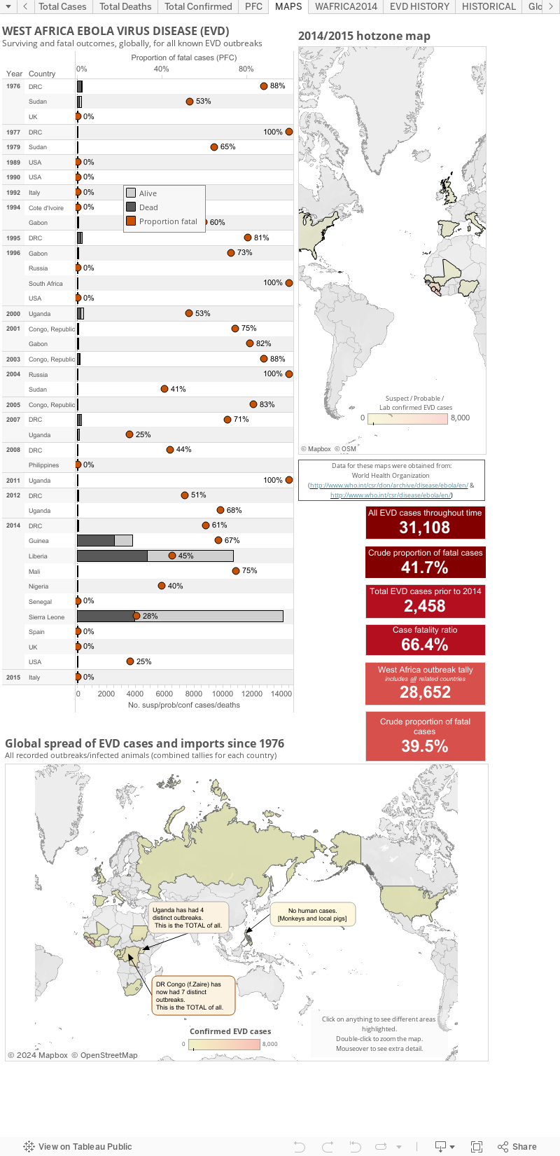
Ebola virus disease (EVD) cases, clusters and outbreaks mapped out...

The West African region epidemic (top map), including countries with imported cases and the totals from past Ebola virus disease outbreaks and the few imported monkey cases (the US & Philippines [hence zero human cases]) plotted by total numbers and country (bottom map).

These maps are best viewed alongside my Ebola virus disease numbers page found here.


The WHO create multi-page Situation Reports [2] and brief Situation Summaries.[3] They are currently presented on Wednesday and "additional updated figures" will be posted "as they become available any day of the week" (via eMail to journalists from WHO).

My totals include all countries that have hosted a case in, or sourced from, a West African nation. Countries include Guinea, Liberia, Sierra Leone, Nigeria (now EVD-free), Senegal (now EVD-free), the United States of America, Spain and Mali.

This is a static page but as of 21-Jan-2015 (AEST) I have copied the maps to the bottom of my main EVD EBOV|Makona (west African Zaire ebolavirus variant) outbreak page at:  http://virologydownunder.blogspot.com.au/2014/07/ebola-virus-disease-evd-2014-west.html


A note about the proportion of fatal cases (PFC): 
On these graphs, my PFC calculations for West African countries and the DRC are based on dividing the total number of suspect/probable/confirmed deaths by the number of total suspect/probable/confirmed cases for the same date. This is crude and may be a sizable underestimate of the true PFC.

It may be better to use the deaths at the most recent date divided by the total cases from 9-16-days  earlier (this number is not precisely known) to better account for the lag in time between presenting to a treatment facility and dying (for those who do not recover). 


Some estimates suggest the true PFC may be closer to 70%-80%. I don't have enough data (or smarts) to be able to calculate the lag for now so please be aware that the PFC above is likely an underestimate.


  • The figure above, as with all on VDU, is made for general interest only. It is also freely available for anyone's use, just cite the page and me (Dr. Ian M Mackay, PhD) please. It may be that I have misinterpreted the language in the reports (sometimes a little tricky to wade through) or miscalculated some totals based on the way data have been presented. 
  • Sometimes there are very country-specific differences in what gets presented to/via the World WHO DONs/SitReps which make this process less clear than it could be. I recommend you have a read and compare the data from each of the countries for yourself to understand these issues. 
  • As I've talked about previously,[1] these numbers are all volatile for a variety of reasons, some Ebola-specific, so regard this chart for its trends only.
  • I am only able to plot what is publicly available. To date, this does not include granular data with dates of onset, or daily data of any kind. The WHO have these data and you will see them become more available through their Situation Reports found here http://www.who.int/csr/disease/ebola/situation-reports/en/
References... 
  1. Ebola virus disease and lab testing...
    http://virologydownunder.blogspot.com.au/2014/04/ebola-virus-disease-and-lab-testing.html
  2. Ebola virus disease outbreak Situation Reports (SitRep)
    http://www.who.int/csr/disease/ebola/situation-reports/en/
  3. Ebola virus disease outbreak Situation Summaries (SitSumm)
    http://apps.who.int/gho/data/view.ebola-sitrep.ebola-summary-latest?lang=en

Friday, 4 July 2014

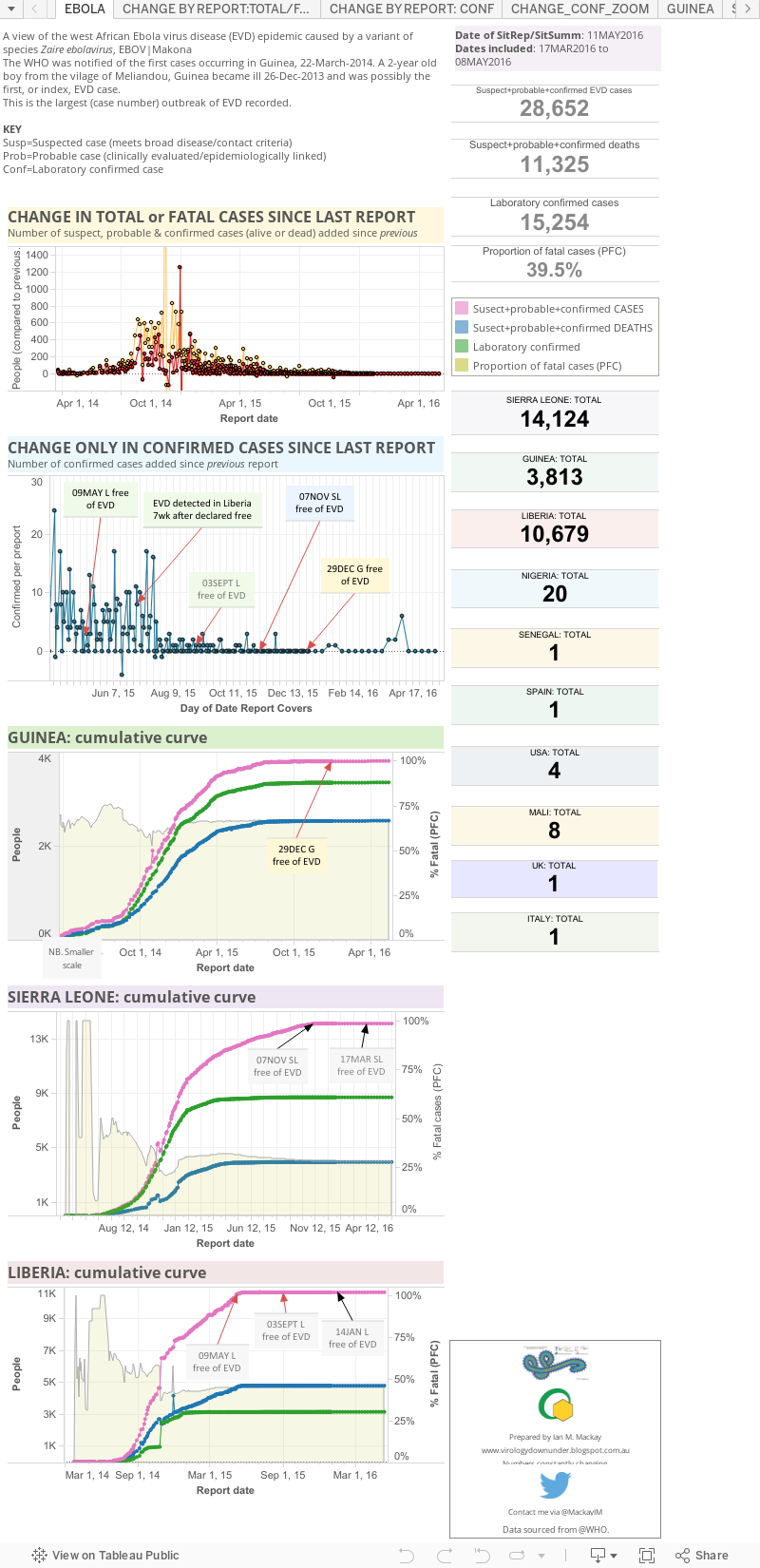
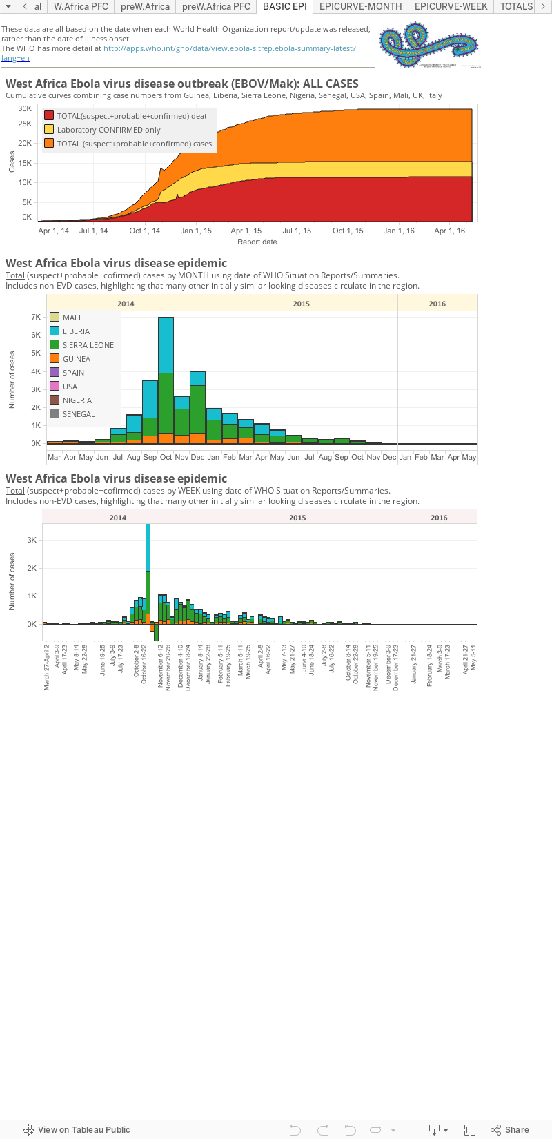
Ebola virus disease (EVD) 2014 West African outbreak..

I will update this static page (link won't change so you can bookmark it) with the 2014 West African Ebola virus disease (EVD) numbers after they are released by the World Health Organization (WHO). The date these graphs were last updated is listed at the top of the first panel or "dashboard" of graphs an totals .

The WHO create multi-page Situation Reports [2] and brief Situation Summaries.[3] The SitRep's are currently presented on Wednesday and "additional updated figures" will be posted" a SitSumm when they become available any day of the week" (via eMail to journalists from WHO).


My totals include all
 countries that have hosted a case in, or sourced from, a West African nation. Countries include Guinea, Liberia, Sierra Leone, Nigeria (now EVD-free), Senegal (now EVD-free), the United States of America, Spain (now EVD-free), Mali (now EVD-free) and the United Kingdom. 'EVD-free means there are no known cases of EVD in the country. Some countries bring in cases of EVD to treat them; they can be defined as free of Ebola virus transmission, but not technically free of the EVD.


The West African region epidemic (top map below), including countries with imported cases and the totals from past Ebola virus disease outbreaks and the few imported monkey cases (the US & Philippines [hence zero human cases]) plotted by total numbers and country (bottom map).


A note about the proportion of fatal cases (PFC): On these graphs, my PFC calculations for West African countries and the DRC are based on dividing the total number of suspected+probable+confirmed deaths by the number of total suspected+probable+confirmed cases on the same date. This is crude and is an underestimate of the true case fatality ratio (CFR) which has stood at ~70% throughout the epidemic.[2]

Reminders: 

  • The graphs above, as with all made by me VDU, are made for general interest only. It is also freely available for anyone's use, just cite the blog (http://virologydownunder.blogspot.com.au/) and me (Dr. Ian M Mackay, PhD) please. It may be that I have misinterpreted the language in the reports (sometimes a little tricky to wade through) or miscalculated some totals based on the way data have been presented. 
  • Sometimes there are very country-specific differences in what gets presented to/via the World WHO DONs/SitReps which make this process less clear than it could be. I recommend you have a read and compare the data from each of the countries for yourself to understand these issues.
  • As I've talked about previously,[1] these numbers are all volatile for a variety of reasons, some Ebola-specific, so regard this chart for its trends only.
  • I am only able to plot what is publicly available. To date, this does not include granular data with dates of onset, or daily data of any kind. The WHO have these data and you will see them become more available through their Situation Reports found here http://www.who.int/csr/disease/ebola/situation-reports/en/ 
  1. References... 
    1. Ebola virus disease and lab testing...
      http://virologydownunder.blogspot.com.au/2014/04/ebola-virus-disease-and-lab-testing.html
    2. Ebola virus disease outbreak Situation Reports (SitRep)
      http://apps.who.int/ebola/en/current-situation
    3. Ebola virus disease outbreak Situation Summaries (SitSumm)
      http://apps.who.int/gho/data/view.ebola-sitrep.ebola-summary-latest?lang=en

Thursday, 3 July 2014

Ebola Virus Disease (EVD) West Africa update for 1-July-2014... [UPDATED]

Some quick visualizations of the Zaire ebolavirus outbreak data based, as previously,[1] on the World Health Organization's publicly available data.

The presentation below is made using Tableau, a new platform for me so please let me know of anything that has failed, numbers that are wrong, something that's translated / formatted badly on your device...whatever. Tableau certainly allows for much faster updating of charts...once you've put a leash on it anyway.

PLEASE NOTE: I now have these same data on a static page (one with a webpage address that does not change with each updated blog).
Please vist the links below for the latest EVD numbers and maps.


References...
  1. Ebola virus disease (EVD) West Africa update for 24-June, WHO-AFRO update...
    http://virologydownunder.blogspot.com.au/2014/06/ebola-virus-disease-evd-west-africa_25.html
  2. Ebola virus disease, West Africa – update | Disease outbreak news | 1 July 2014
    http://www.who.int/csr/don/2014_07_01_ebola/en/
  3. Ebola virus disease and lab testing...
    http://virologydownunder.blogspot.com.au/2014/04/ebola-virus-disease-and-lab-testing.html

Wednesday, 25 June 2014

Ebola virus disease (EVD) West Africa: 24-June WHO-AFRO update...

Apart from something unexplained going on with the wording &/or numbers in the Sierra Leone portion of the report, the latest Disease Outbreak News (DON) from the World Health Organization (WHO) reports a continuing climb in the case numbers, particularly those from Sierra Leone.

The cumulative totals of suspected/probable/ fatal EVD cases, just fatal cases and the numbers confirmed by laboratory analysis. Latest data are based on WHO DON.[1] Lines use the numbers on the vertical axis on the left, bars use the right hand axis. The percentages are the proportion of fatal cases at the time point indicated.
Click on chart to enlarge.


The country-based EVD cumulative totals. Latest data are based on WHO DONs (see latest, [1]). Lines use the numbers on the vertical axis on the left. The percentages are the proportion of fatal cases at the time point indicated.
Click on image to enlarge

A reminder:
The chart above, as with all on VDU, is made for general interest only. It is also freely available for anyone's use, just cite the page and me please. It may be that I have misinterpreted the language in the reports (sometimes a little tricky to wade through) or miscalculated some totals based on the way data have been presented. 
There are very country-specific differences in what gets presented to/via the World Health Organization's Disease Outbreak News which make this process less clear than it could be. I recommend you have a read and compare the data from each of the 3 countries for yourself to understand these issues. 
As I've talked about previously,[2] these numbers are all volatile for a variety of reasons, some Ebola-specific, so regard this chart for its trends only.

References...
  1. Ebola virus disease, West Africa - update
    http://www.who.int/csr/don/2014_06_24_ebola/en/
  2. Ebola virus disease and lab testing...
    http://virologydownunder.blogspot.com.au/2014/04/ebola-virus-disease-and-lab-testing.html